Researching Qualitative Public Participatory Data Visualizations & Challenges
UX Design & Research Associate @ UCSD Design Lab
Challenge
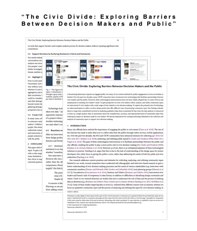
Using data from CommunityCrit, we created UI screens and interviewed 27 users to understand how civic decision-makers use public data, our UX research culminated in a CHI 2019 submission on large-scale civic engagement systems.
What I did:
During my internship, I was in charge of researching metrics and designing UI for their new organizational dashboard, a tool that would allow administrative-users to assess their schools.
Deliverables
Design
Challenge
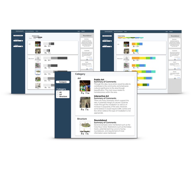
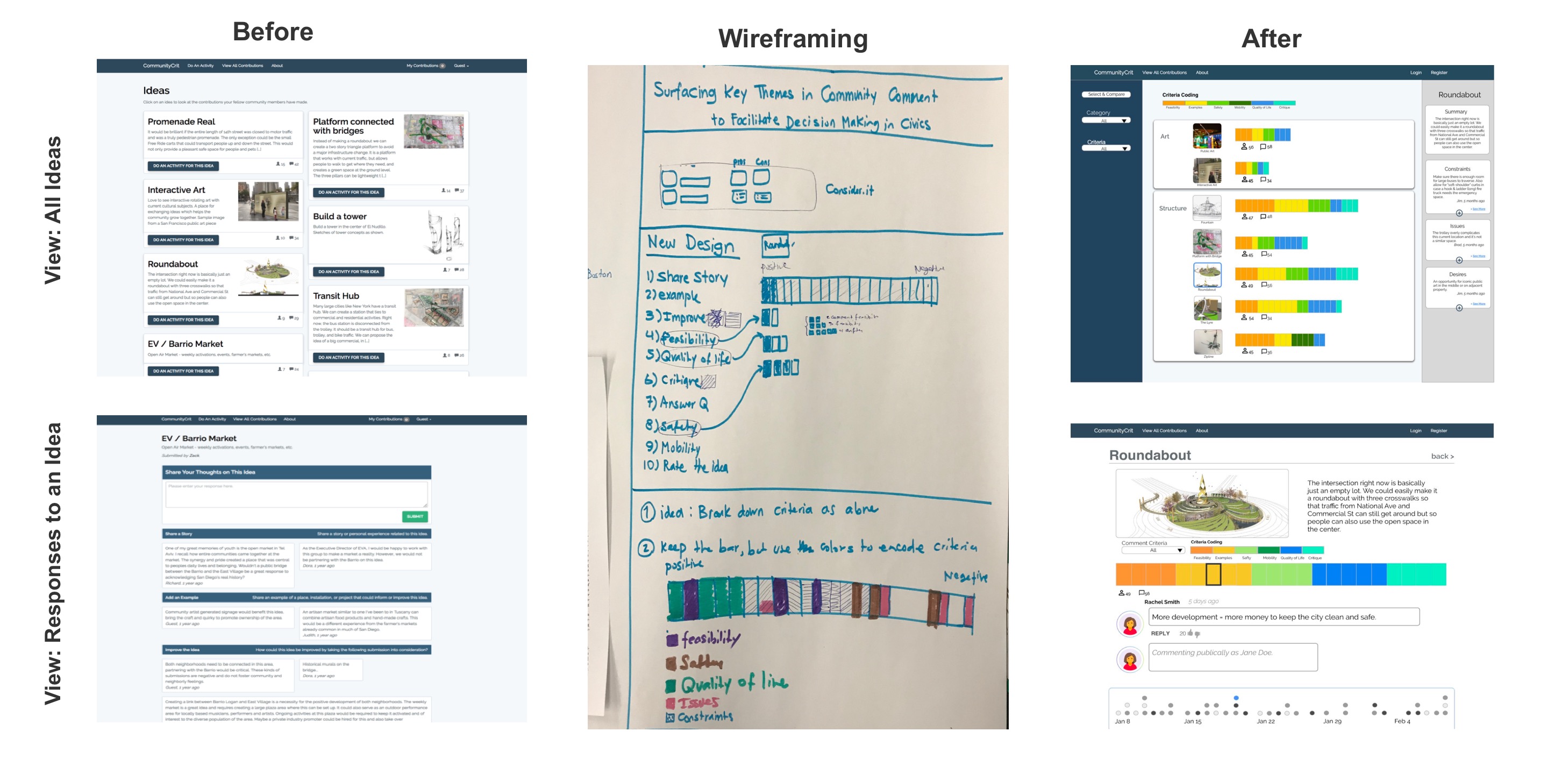
Using the quanitative civic participation data from CommunityCrit, we wanted to understand which visualization would be most affective for both civic leaders and decision-makers as well as the public, such as surfacing trending ideas or key words from the comments.
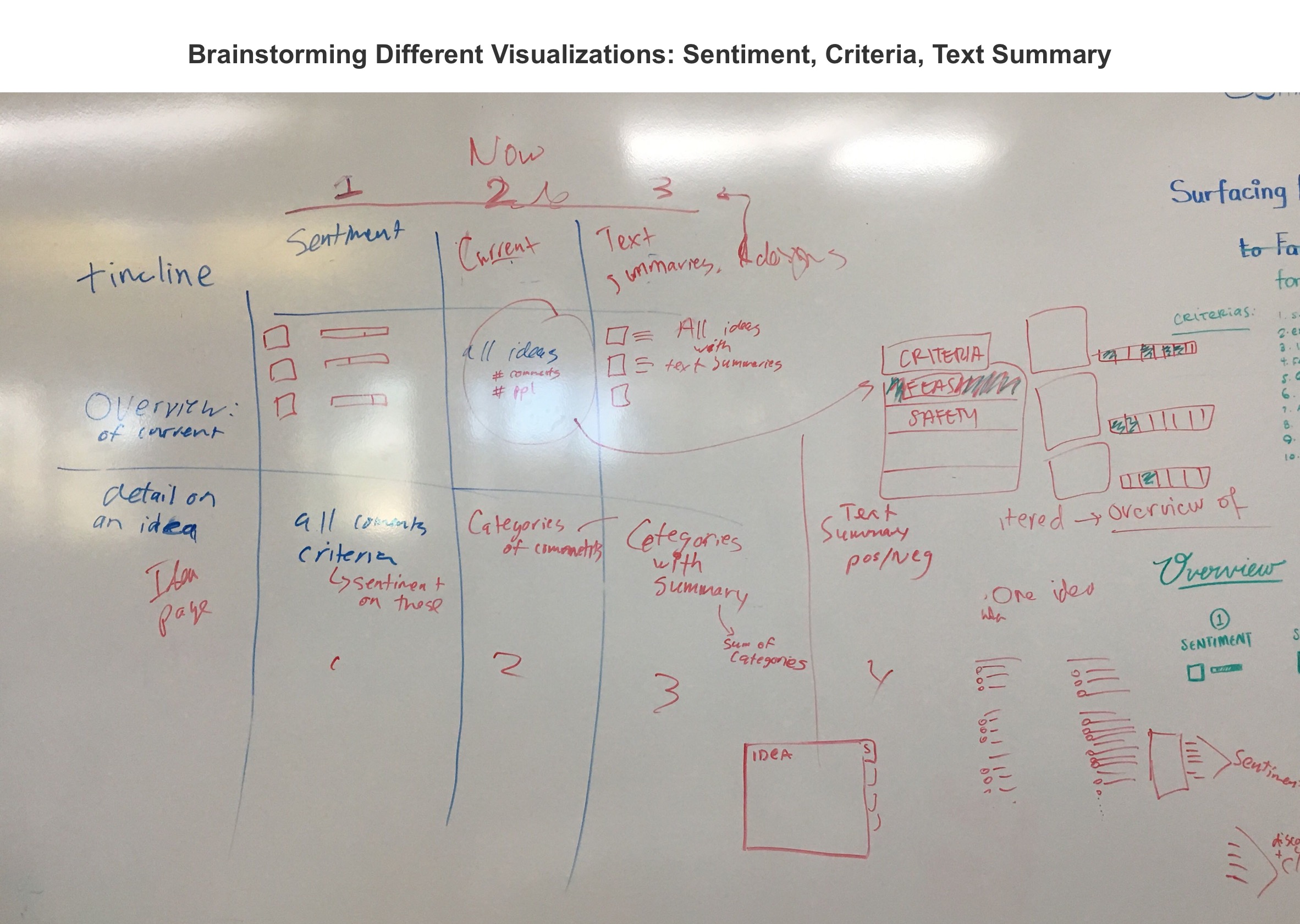
Brainstorming UI
I worked with a team of 4 other designers to create the UX of the dashboards. To better transform qualitative data into quantitative, I added a side panel so people can easily add restraints, constraints, and desires which eventually formed poll charts that users could visually extrapolate these key points from. Based on interviews, I included a timeline so civic leaders can see how the public responded after certain town hall meetings, ect.
Research
Creating Questions & Survey
I constructed the main interview goals and online survey using Google Forms; then as a team, collaborated on interview questions. Our aim was to evaluate users' experience with public data and the pros-cons of our design UI.
Ethnography & User Testing
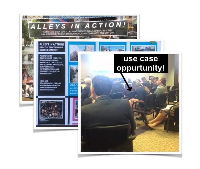
I conducted ethnography at public board meetings and community-building events, where I took pictures and notes, looked for use case oppurtunities, observed interpersonal behaviors, and interviewed users. I also did geurilla user testings with the prototypes and found the challenge for decision makers was not a more efficient platform, but more reliable data collection. Based on my reserch, we pivoted our question from "which data visualizations are the most effect for decision makers?" to "what are the challenges with collecting, gathering, and analyzing public data?"
Formal Interviews Remotely & On-Site
I conducted over 7 1-hour interviews over the course of a week. Then transcribed the audio recordings into a transcription index of main ideas and quotes.
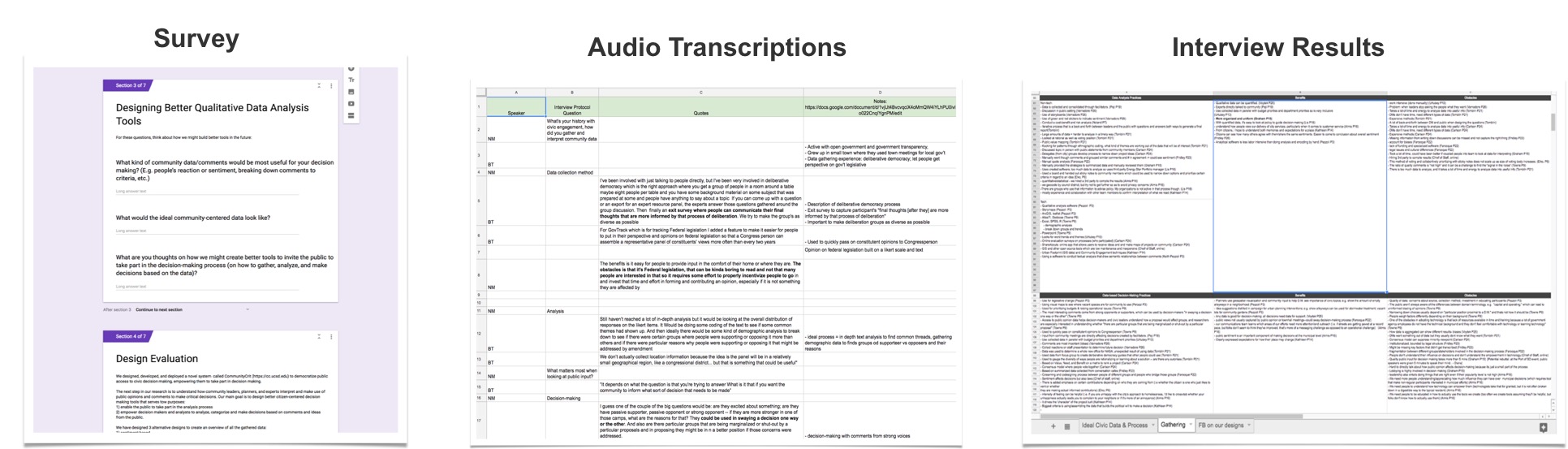
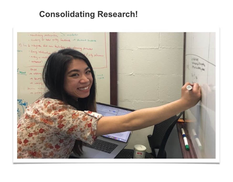
Surfacing Main Ideas
We organized our data into categories: data collection, analysis, and utilization practices; design feedback; ideal civic data & practices for the results section.
"The potential customers doesn’t want to know about a feature or a function [but want to know] what it’ll do for them...for the analytic type, they love the busy chart but for others it can be scary. Simple [designs] like this works and it is good that they can drill down deeper."
Results
Presented findings to UCSD Design Lab
We did a fifteen minute presentation to the researchers and professionals at UCSD Design Lab. We set a record for interviewing and writing a paper within a month!
Submitting to CHI 2019
The last month of the research was spent editing and fixing the paper for CSWW and CHI 2019 journal, where I also peer-reviewed a few articles!