Researching Metrics and Designing UI of EdTech Analytics Dashboard
Product Design Intern @ Learning Equality
Brief
Learning Equality is a non-profit organization delivering an edTech software to countries with limited internet. We wanted to create that allowed organization and education administators to view student, teacher aned program progress. The solution was a straight-forward dashboard focused around session times, student mastery, and tracking content performance that allows users to aggregate or compare performance across different levels and content channels.
What I did
During my internship, I was in charge of researching metrics and designing UI for their new organizational dashboard, a tool that would allow administrative-users to assess their schools.
Deliverables
Research
Contextual Analysis
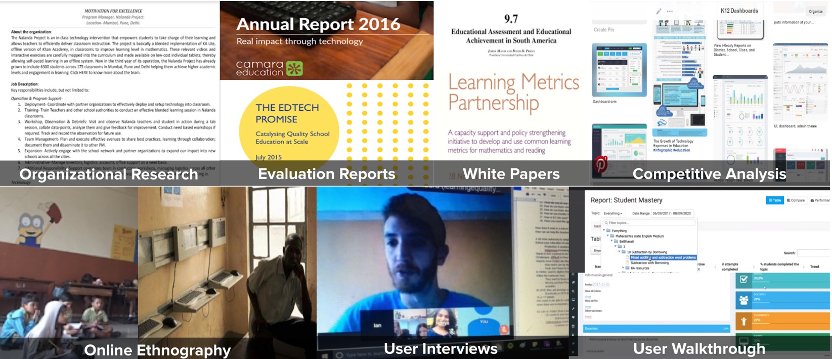
I worked with a large internal resource of existing research and documents about our users, this included: evaluation reports and organizational documents from our partners, project debriefings, past ethnography, past research and meeting notes, and white papers about various continent’s education systems, as well as the value of learning metrics and how to optimize them for learning assessments — storing my annotations to be shared on the company's Google Drive.
Competitive analysis
I compared other online edTech UI features and metrics while doing an intake of frequent elements, the positives, and negatives. I used Pinterest to maintain and share a library of edTech UI trends.
User Interviews & Stakeholder Interviews
After identifying our research goals, I created questions for stakeholders and users that I formally interviewed remotely. Participants included 8 different education or non-profit leaders from 4 different continents. I turned these into empathy maps that described goals, motivations, challenges, ect. I also met with various team members to learn about the technical capabilities, release schedules, and product implementation.
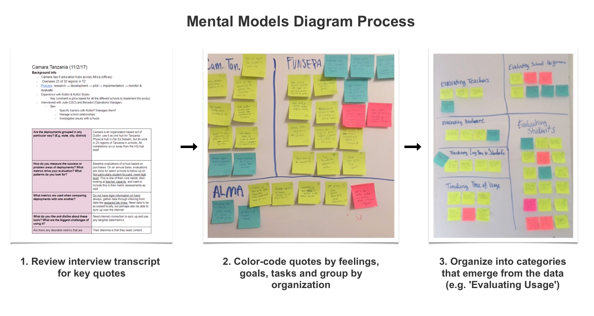
Mental Models / Affinity Map
For each organization, I wrote down all the insights on post-its, grouping the colors by tasks, feelings/motivations, and goals. Then, I examined the aggregate of notes for common user goals, such as tracking hardware usage, and grouped them to understand the user’s mental model associated with that common goal.
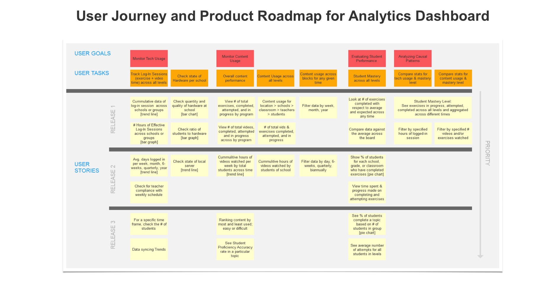
User Journey and Product Roadmap
I combined the affinity map with the other quantitative data (reports, personas, competitive analysis, task analysis) to fill in holes for common needs and metrics. This created a more cohesive, universal mental model that addressed the diverse stories of all involved NGOs’. The user goals were based off the metrics needed to accomplish organizational goals, the user tasks were based off of the mental models associated with each goal (or the assessments they need to make), and the user stories depict the data visualizations they would engage in as they proceeded through their goals.
Design

Sketching & Brainstorming
Because internet connection was the biggest challenge, first goal was to understand the technical constraints and how data was getting shared between systems. We brainstormed what types of data was feasible and most important for the MVP release.
I also sketched useful data visualizations that could be included as I went through interviews and evaluated other dashboards.
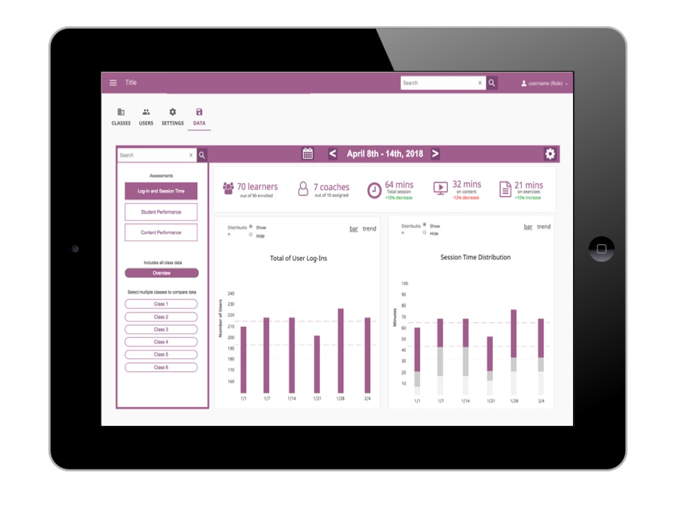
Creating the Prototypes
During the last 3 months of my internship, I focused on creating the prototypes that the company used to user test. After getting approval for my wireframes with my supervisors, I used Axure to create the prototypes.
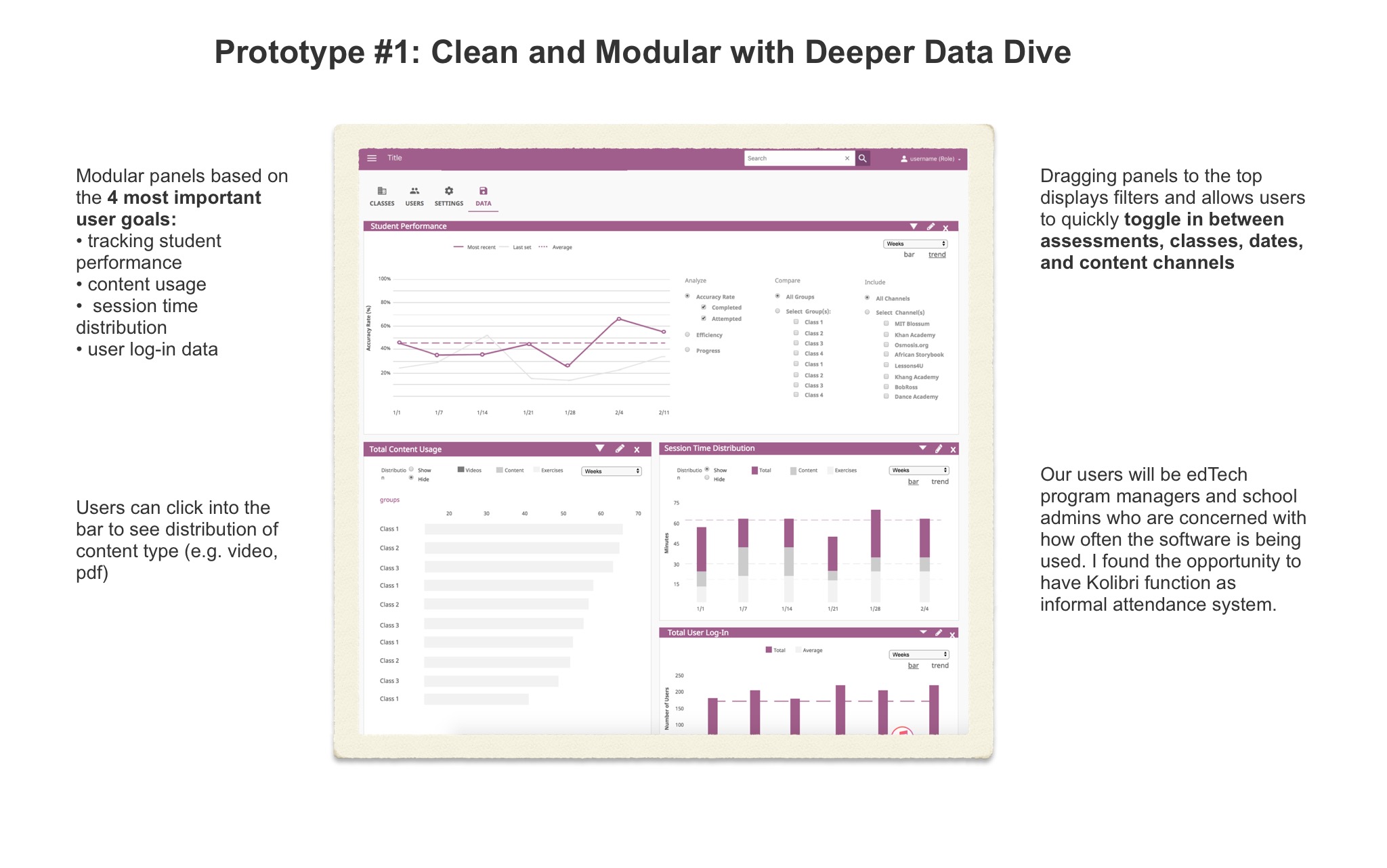
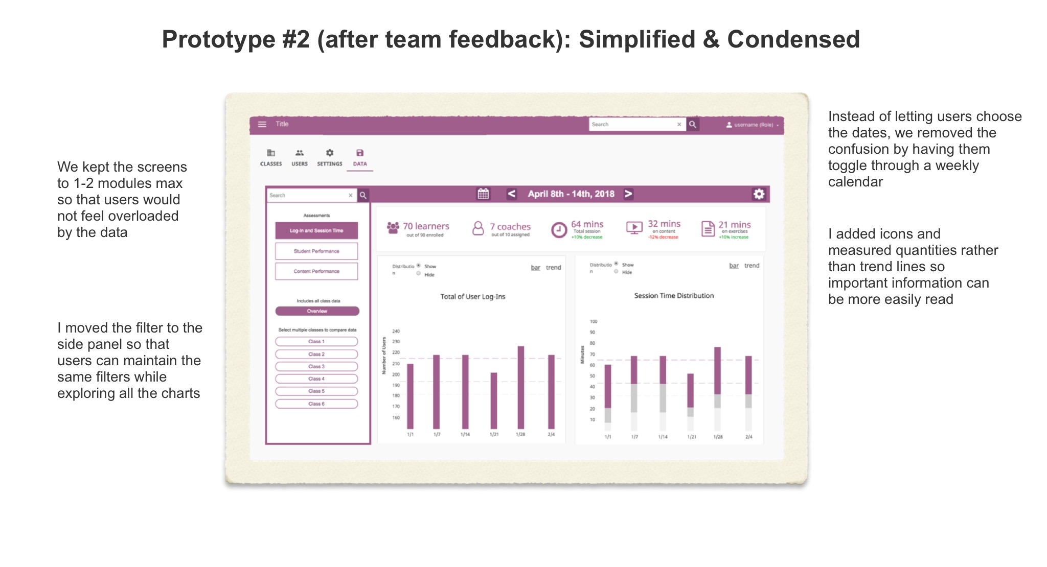
Feedback-based Revision
After demoing my first prototype at a design review and testing on users, I used the feedback they gave me to reconstruct a more simplified visualization, one that incorporated less filters and graphs as to not intimidate our less tech and data-knowledgable users.